

Mean Absolute Percentage Error (MAPE) Has Served Its Duty and Should Now Retire
Executive summary
According to Gartner (2018 Gartner Sales & Operations Planning Success Survey), the most popular evaluation metric for forecasts in Sales and Operations Planning is Mean Absolute Percentage Error (MAPE). This needs to change. Modern forecasts concern small quantities on a disaggregated level such as product-location-day. For such granular forecasts, MAPE values are extremely hard to judge and thereby disqualify as useful forecast quality indicators. MAPE also deeply misleads users by both exaggerating some problems and disguising others, nudging them to choose forecasts with systematic bias. The situations in which MAPE is suitable become increasingly rare. This is not dry theory: We simulate a supermarket that relies on a MAPE-optimizing forecast value fed into replenishment. The under- and overstocks in the fast- and slow-sellers quickly push the store out of business.
When absolute and relative errors contradict — whom should we trust?
You predicted a demand of 7.2 apples and 9 were eventually sold. You predicted 91.8 bottles of water and 108 were sold. You predicted 1.9 cans of tuna and one was sold. How do you judge these forecasting errors? A straightforward approach is to compute the absolute deviation of the prediction to the actual and divide by that actual, i.e. the relative absolute error, possibly as a percentage value (absolute percentage error, APE). That reads much more involved than it is: Coming up with APE as a first shot for “forecast quality evaluation” is quite typical. For the three examples, you obtain APEs of seemingly moderate 20% (=|7.2-9|/7.2), modest 15% (=|91.8-108|/108) and alarming 90% (=|1.9-1|/1), respectively. The MAPE, mean absolute percentage error, is the arithmetic mean of these three percentages, and amounts to 41.67%. These error percentages convey that the forecast on tuna is worse than the one on apples, and the forecast on bottles outperforms the others. But does this truly reflect forecast quality? Look again at the beginning of this section — the large absolute difference between forecasted and actual water bottles is worrisome, and its small relative error cannot really reassure you. On the other hand, the 90% error on tuna could be due to random (bad) luck — it amounts to only a single item. Should you keep your intuition quiet, and blindly rely on the APEs? Consequently, should you revise the tuna forecast and leave the water forecast as it is? If another forecast is issued, with an overall MAPE of only 30%, is that new forecast necessarily better?
Of course, under no circumstance would I ever seriously ask you to ignore your human judgement! This unpleasant paradox is resolved below: MAPE is unsuitable for modern probabilistic forecasts on granular level (i.e. on product-location-day, on which “small” numbers or even “0” can occur), due to several intolerable and unsolvable problems. A forecast’s MAPE doesn’t tell us how good that forecast is, but how oddly APE behaves.
Consciously ignoring scale: When percentage errors can make sense
Before diving into granular forecasting in retail (on product-location-day level), let’s suppose to predict a much larger quantity: The yearly gross domestic product (GDP) of countries, measured in US$. Such forecast might be used to define policies for entire countries, and these policies should be equally applicable to countries of different sizes. Therefore, it is fair to weight each country equally in this use case: A 5% error on the US GPD (about 25 trillion US$) hurts just as much as a 5% error on the Tuvalu GPD (about 66 million US$, 380,000 times smaller than the US GDP). Here, absolute percentage error (APE) makes sense: The actual GDP is never close to 0 (which would cause a terrible headache when dividing by it, I’ll come to that below), and the forecast aim is not to get the overall GDP of the planet right, but to be close as possible for each individual country, across scales ranging from millions to trillions. Minimizing the total absolute error of the model (i.e. error in US$, not in percentages) puts the largest economies into the spotlight and disregards the small ones. It does not weight each country equally, but by its economic power. A model with a nice 3% error on the US GDP and an unacceptable 200% error on the Tuvalu GDP would appear to be “better” than a model with 4% error on the US GDP and 10% error on Tuvalu GDP in absolute US$ terms. MAPE, on the other hand, points towards using the latter forecast, which sacrifices a lot of absolute GDP accuracy on the US (1% of 25 trillion US$) for a modest absolute improvement of the accuracy on Tuvalu (190% of 66 million US$). The US GPD is much larger than Tuvalu’s, but one would consciously, and for good reasons, decide to treat them equally. Both the US and Tuvalu can be considered “large” in the sense that one can’t expect statistical fluctuations or “bad luck” to be responsible for forecast error — i.e. deviations will typically be statistically significant and point towards model improvement potential.
In summary, whenever single instances of a forecast of different values should be treated in an equal way, i.e. whenever we are fine with comparing enormous apples to miniscule oranges, MAPE can make sense. But is an equal treatment always fair?
Treat all the same — sounds good in general, but not in probabilistic forecast evaluation
Let’s return to our previous example in grocery and talk about apples, tuna cans and bottles. Here, comparing APEs makes little sense, for two reasons.
By definition, a slow-seller sells less often than a fast-seller. The business impact of an unreliable slow-seller forecast is, therefore, much less severe that for an equally unreliable fast-seller forecast. A 5% sales loss due to stock-outs in some marginal slow-seller is merely inconvenient for the vendor, while a 5% sales loss on the best-selling item can be quite dramatic. At the end of the day, absolute numbers count for your business. You overpredict the total demand of your main product in the US by 20%? You probably have a problem and need to deal with lots of unsold stock, which might even put your entire business at jeopardy. You overpredict the total demand of that same product by 20% in Tuvalu? Nothing against Tuvalu (no offense, really!), but you can probably relax, since that error won’t sink your business. You can tolerate much larger relative error in petty assortments or markets than in your bread & butter categories. Why promote marginal items or groups of customers to the same importance as the really big fish?
Adding to this obvious difference (small is small and large is large), there is a subtle-looking but important statistical effect: Scale-dependence of achievable forecast accuracy. Being 10% off for a product that sells 10 times a day is unavoidable sometimes, even for a perfect forecast (with Poisson uncertainty). Being 10% off on a product that sells 10,000 times a day clearly points towards a problem. Not only is the slow-seller less important business-wise than the fast-seller, but it naturally comes with larger relative errors, as discussed in more detail in the previous blog posts “Forecasting Few Is Different,” Part 1 and Part 2.
For the grocery forecasts above, you probably have just been unlucky regarding the tuna on that day. The 16 additional bottles of water seem less excusable. Therefore, absolute percentage error (APE) does not catch achievable forecast quality well, neither in business terms (it weights unequal things equally) nor in statistical terms (its achievable value needs the context of the forecasted value itself).
Governing replenishment by MAPE leads to catastrophic stock levels
In other words, MAPE is not a good indicator for forecast quality per se: Whether 20%, 70%, 90% are reached in three different situations has no immediate interpretable meaning. Given a certain MAPE-value, one should not jump at any conclusion. But even accepting that a MAPE-value itself tells you little to nothing about your overall model quality, you might nevertheless expect that, for a given forecasting situation, the MAPE-winning forecast should be the best one. As I’ll work out now, you need to also give up that weaker expectation.
Consider a supermarket that offers many different products — from slow-sellers that sell about once per quarter up to fast-sellers that sell 100 times per day. The replenishment of items is done by a system that picks the daily MAPE-optimal forecast and pre-orders according to it. That is, it chooses the forecast value for which the MAPE is lowest. How would that supermarket perform?
To keep things simple, focus on 5 exemplary products: Apples, bananas, cashews, dragon fruits and eggplants, with true mean daily selling rates of 0.01, 0.1, 1, 10 and 100: The slowest, apples, sells about once per quarter, the fastest, eggplants, sells 100 times per day (you are right if you suspect that numbers were not made up for real-world plausibility, but rather mathematical clarity and simplicity). In this thought experiment, we know these selling rates, and they are the best possible forecast for each product by construction. Using the Poisson distribution, we can simulate what happens, and what is the forecast value with the best MAPE.
For each product, the following table shows the true selling rate (which is the unbiased best daily forecast), its simulated MAPE, the optimized MAPE-winning forecast, its simulated MAPE and its resulting bias:
| Product | True daily selling rate, unbiased daily forecast | MAPE of true selling rate | MAPE-winning daily forecast | MAPE of MAPE-winning forecast | Forecast bias of MAPE-winning forecast |
| Apples | 0.01 | 99% | 1 | 0.25% | +9,900% |
| Bananas | 0.1 | 90% | 1 | 2.5% | +900% |
| Cashews | 1 | 23.3% | 1 | 23.3% | 0% |
| Dragon fruits | 10 | 31% | 9 | 29% | -10% |
| Eggplants | 100 | 8.11% | 99 | 8.05% | -1% |
Remember that the true daily selling rate is inarguably the best possible input to the replenishment system, since it is, by construction, the mean value of expected sales. What happens if replenishment uses the MAPE-winning forecast instead? The supermarket overstocks on the slow-movers: For every day, one apple, one banana and one cashew are replenished — but apples only sell once every 100 days and bananas once every 10 days! Apples and bananas pile up, cashews do fine, while the demand of dragon fruits is not met: On average, one customer who wanted to buy a dragon fruit will leave without having their shopping completed. For the fast-moving eggplants, the 1% error might be excusable — nevertheless, it is striking that the “best” forecast is always biased, unless the true selling rate equates 1.
The numbers computed for the table above assume a perfect world in which forecasters enjoy working with a model with minimal Poisson-uncertainty. For a more realistic model in which some moderate additional uncertainty (technically speaking: overdispersion) is present, the situation immediately looks worse:
| Product | True daily selling rate, unbiased daily forecast | MAPE of true selling rate | MAPE-winning daily forecast | MAPE of MAPE-winning forecast | Forecast bias of MAPE-winning forecast |
| Apples | 0.01 | 99% | 1 | 0.3% | +9,900% |
| Bananas | 0.1 | 90% | 1 | 3% | +900% |
| Cashews | 1 | 25% | 1 | 25% | 0% |
| Dragon fruits | 10 | 73% | 6 | 53% | -40% |
| Eggplants | 100 | 49% | 72 | 40% | -28% |
The gap between the MAPE value computed at the true selling rate and the MAPE value of the MAPE-winning-forecast has increased substantially. In other words, the user might think that the “evidence” that the MAPE-winning forecast is better than the other is even stronger than above. The MAPE-optimal-forecast is, however, more strongly biased than in the ideal situation: The underforecasting in dragon fruits and eggplants now amount to 40% and 28%, respectively — a massive stock-out-situation would be the consequence. Below, we will see why more uncertainty means “we need to play safe” and why that means “we need to play rather low”.
Clearly, a supermarket that runs with this strategy will not survive for long! The problems with MAPE thus go beyond the business interpretability (it’s unsuitable to answer the question “how good is the forecast?”) but can potentially lead to severe operational problems (choosing an inarguably worse forecast over a better one). Let’s explore why!
MAPE censors zero-count-events, with catastrophic consequences
When computing APE, we run into serious trouble when the actual is zero, as we would need to divide by it. The APE is then undefined and does not enter the computation of MAPE (remember, it’s the mean of all APEs). That is, zero-sales-events are simply removed from the data. This data removal as bad as it feels: It leads to a blatant overprediction bias on super-slow-movers (which sell once or less per time period) in a MAPE-optimal prediction: Since 0-events are ignored, the lowest reasonable prediction for any product, location and day is 1 — even for a product that sells once per year! Since the MAPE-optimized forecast can safely ignore the outcome “0”, playing safe is proposing “1” as lowest forecast value. Alternatives to removal (e.g. assign 100% error always instead of removal) do not solve this problem: A prediction of 1.7 with outcome 0 is clearly less problematic than a prediction of 17,000 with outcome 0; assigning those two events the same artificial APE makes no sense. That is, whenever your data could plausibly contain “0” as actual value for any event, MAPE is extremely problematic. Optimizing it will lead to overpredictions in the super-slow-moving items — as we see in the first two rows of the tables.
MAPE penalizes under- and overforecasts differently, leading to skewed estimates
Predict 1, observe 7: The APE is 6/7, approx. 86%. Does that seem a lot to you? If so, exchange the numbers, predict 7, observe 1: Your APE becomes 6/1, 600%! APE penalizes an overprediction by a certain factor much more heavily than for an underprediction by the same factor. For underpredictions, the worst possible APE is 100%; for overpredictions, it is unbounded. As a result, whenever you are not certain about the outcome (you should never be, and every good model knows about its own uncertainty in a way) playing safe is playing low: Avoid strong overforecasting at (almost) any cost, whereas some massive underforecasting will not break your neck. Therefore, even under minimal forecast uncertainty, which we assumed in the first table, the MAPE-optimal forecast is an underprediction for selling rates above 1 (last two rows). Moreover, the larger the variability of the training data is, the more uncertain the model, and the more will the MAPE-optimal forecast underforecast: Remember, playing safe is playing low, and the more uncertain you are, the safer you want to be, and the lower the MAPE-optimal forecast becomes. This hedging against overpredictions leads to the strong bias in the last two rows of the second table. This asymmetry is tackled by modified MAPEs: For example, the percentage error can be computed with respect to the mean of prediction and actual instead of actual only — but also these amendments don’t fully solve the asymmetry and induce other problems and paradoxes.
MAPE exhibits particularly complex scaling behavior, leaving us ignorant on how good a forecast really is
Admittedly, the lack of interpretability (is 50% MAPE good or bad?) is not an exclusive feature of MAPE: Every metric has scale-dependence and assumes different values for slow- and for fast-movers. Nevertheless, the scaling of MAPE is especially intricate and complex, due to the combination of the two aforementioned effects: On the one hand, a MAPE-optimal forecast will never output a number smaller than 1 and we just remove the 0-sale-outcomes. On the other hand, relative errors decrease for large selling rates. In this plot, we show “mount MAPE,” the best possible achievable MAPE as a function of selling rate.
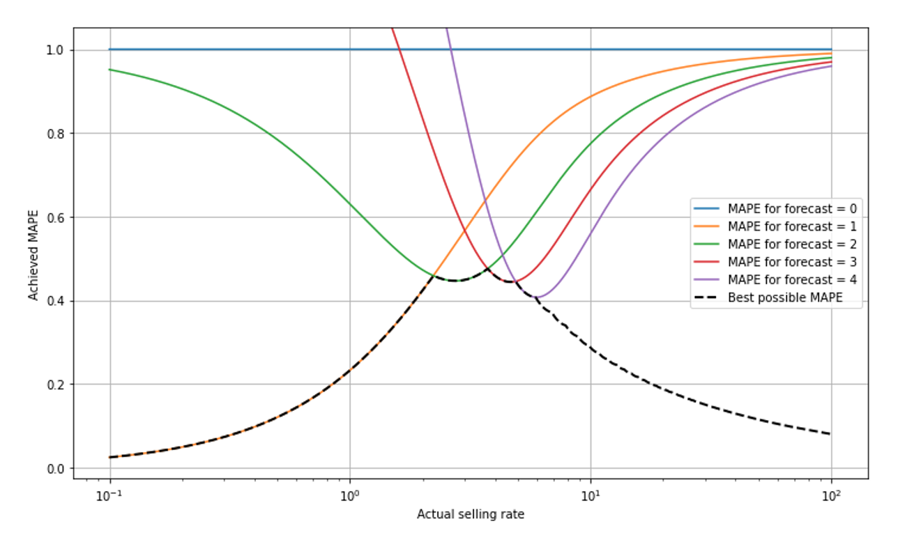
Take a deep breath and give me a chance to explain what you see: The x-scale is logarithmic so we can observe small selling rates well — the scale goes from 0.1 to 100, super-slow to fast. For small selling rates below around 2, a forecast of 1 is the best possible, it yields the MAPE value given by the orange line that goes from the lower left (where it’s overlayed by the black dashed line) to the upper right. The forecast 2 would lead to large MAPE in the slow-movers (green line), close to 95% for a selling rate of 0.1. The forecast 0 always leads to a constant MAPE of 100% (blue line): For any outcome that is not 0 (and those are removed from evaluation), we have APE=|actual-0|/actual=100%. At a selling rate of around 2.3, the forecast 2 becomes the optimal one, hence the black dashed line, the best possible MAPE, jumps from the orange to the green line. It further takes turns whenever the best forecast jumps from one value to the next (shown for forecast 3 and 4 in red and purple, respectively).
The best possible MAPE decreases when we go to very slowly moving items (to the left): Since 0-sales-events are removed from the data, the “surviving” events are mostly 1-sale-events, and even more so the more slowly the item sells. For a selling rate of 0.1, observing 2 items sold on a single day is already highly unlikely, and the forecast “1” is therefore, in most of the non-0-cases, perfect, and the achieved MAPE quite low. In other words, when you know that “0” will be removed from the data and the item is slow, then”1” is a pretty safe bet for the number of sales that occur. For mid-sized values around 1 to 5, we see the “turn-taking” of the best possible MAPE. For large forecasts of 10 or higher (to the right-hand-side of the plot), the achievable MAPE decreases again: the Poisson distribution becomes relatively narrow in the limit of large rates (see our previous blog post on Forecasting Few is Different 1 &2).
I really did my best to explain the shape of “mount MAPE”! It took me more than 300 words in two paragraphs, but I fear it might not be entirely successful: Did you understand it in such a way that you’ll be able to intuitively judge MAPEs in the future, in the context of predicted selling rates? If you don’t feel you will — don’t worry: This complexity is yet another modest argument that, even among professionals, it is unlikely that an intuitive correct judgement of MAPE-values ever become wide-spread.
MAPE-optimal forecasts are irrelevant to business, jeopardizing potential forecast value
The forecast that wins at MAPE is not the unbiased forecast that you would wish in many applications. But what does it then mean to “optimize for MAPE”? Mathematically, the value that minimizes MAPE minimizes a cumbersome-looking expression that I don’t even dare writing down in a blog-post not aimed at statisticians. What you need to know: That expression has no meaningful business interpretation. Whatever you want to achieve with your forecast — ensure availability, reduce waste, plan promotions and markdowns, replenish items, plan workforce… – the business cost of a wrong forecast in your application is certainly not reflected by MAPE! Ideally, choose an evaluation metric that reflects the actual financial cost of “being off”. You don’t want to optimize an abstract mathematical function, but maximize business value.
The alternative: Let the metric directly reflect business
Apart from situations like predicting GDPs country-wise and under strong assumptions, MAPE is neither suitable to indicate how good a forecasting model is (due to scaling), nor a suitable decision driver to choose among two competing models (MAPE-winning forecasts are biased). What is the alternative? Optimally, the metric that is used directly reflects the business value. Mean Absolute Error (MAE) quantifies situations in which the cost of one overstocked item is the same as the cost of one missing item — a strong assumption, but certainly closer to reality than MAPE. MAE carries the same dimension as the prediction itself (“number of items”), and thereby strongly depends on scale. By dividing MAE by the mean sales, we obtain Relative Mean Absolute Error (RMAE), which is, due to the scaling property of the Poisson distribution, not scale-independent either. Scale-dependence therefore always needs to be addressed explicitly.
Just ignoring that optimal MAPE-estimates are biased, however, is not an option: Important strategic decisions hinge on reliable, meaningful, business-relevant forecast evaluation! Shall we go with software vendor A, with software vendor B, or with our in-house solution? On what assortments should we focus our model improvement efforts? Is the forecast in that new category “good enough” for taking an automated system live? Forecast evaluation should provide clear, high-level interpretable, business-reflecting evidence to answer these and many other questions. MAPE can’t help us with that.